GRAPHIC DESIGN
STEPHANIE ZELLER
GRAPHIC DESIGN


NASA-INSPIRED POSTERS
This series of posters was inspired by my dream of working for NASA. Some were made prior to my first internship, others were made during the course, as I became more familiar with the culture and ongoing missions. I wanted to inspire people with this work, and to illustrate the power of a brand like NASA to galvanize an entire generation. Science and technology don't have to be dry and serious.


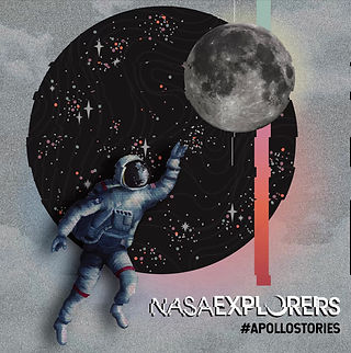
NASA EXPLORERS: APOLLO
In the Summer of 2019, NASA Explorers created a podcast celebrating the 50th anniversary of the Apollo missions. They asked me to work with them on creating the associated poster, album cover, and social media graphics. Read more about the project here: https://www.nasa.gov/nasa-explorers-apollo


SEEC: THE HUNT FOR LIFE BEYOND
The Sellers Exoplanet Environment Collaboration is an interdisciplinary task force of scientists and geologists interested in finding biosignatures on planets outside our own solar system. While working with them at Goddard, I saw an opportunity to paint a custom travel poster in the spirit of Japanese watercolors. This was the outcome. It was displayed at 2018's AGU conference and was so popular, the SEEC stand ran out within an hour.


FLEURS DU MAL, QUE SERA, DAMN. PRINTS
Much of this work can be seen in greater detail on the Traditional Art page. Here, I created watercolors and scanned them into my computer for later alteration. Que Sera began as a watercolor and was added to digitally. DAMN is an homage to Kendrick Lamar's then-newest album release, which I enjoyed greatly. All of these are available as prints in my shop, the link to which lies below, in the main menu. The flowers are also available as stickers.


TEXAS ROCKET ENGINEERING LAB: POSTERS & MISSION PATCH
My role as the Public Relations Manager for the Texas Rocket Engineering Lab, an on-campus laboratory with $1,000,000+ in anonymous funding, has resulted in a series of graphic designs to promote the group and its work. This gallery exhibits a number of posters, as well as a mission patch for the lab that I designed and created. It is now sold on shirts and jackets for the lab.


TEXAS ROCKET ENGINEERING LAB: WINDOW ART & WEB GRAPHICS
As TREL is building a full-scale, liquid propulsion, functioning rocket, to be launched past the Karman line for the first time in student-run-laboratory history, we must comply with the rules of ITAR. As such, our labs must be completely private and accessible only to TREL members. I worked with the University of Texas to turn my posters into window coverings, which serve the dual purpose of obscuring the lab's internal activity to the outside world, while also making the lab space more exciting. External window coverings, a mockup of which appears below, are forthcoming.

LONGHORN RACING OFFICIAL STICKER
Longhorn Racing, an organization on campus that builds and races solar-powered vehicles, came to me with the need for a new official sticker. I created this for the team, and it was sold at numerous events.

MAC MILLER TRIBUTE POSTER
Malcolm McCormick, a rapper my age who gained early fame while we were all beginning high school, died from a drug overdose last year. His music was formative to myself and many of my friends. He was a talented artist who struggled, as many who gain fame early on, with addiction over the course of his career. I made this poster to memorialize him and the work he gave the world.


GET INSPIRED: CUSTOM EMBROIDERED CONVERSE CAMPAIGN
For an art class, I was challenged to film the process of creating something new. I designed and embroidered a flower pattern on these converse shoes, filmed the creation, filmed the shoot, and designed these advertisements with the help of my friend, who modeled the shoes for me.
The full film is available on my Video page.


PRESS FORWARD REBRAND
Part of my work with Press Forward, which can be viewed in its entirety on the Media Planning page, was graphic redesign of many of the nonprofit's elements. The first are suggested rebranding of the Press Forward podcast, which covers issues concerning women in the media. The next is a template for conveying information covered in a recent industry report on women in the media. Finally, I created a number of animated ads promoting Press Forward's vision and purpose, using statistics mined during my team's research phase.


DASEIN HEALTH SOCIAL MEDIA & LOGO REBRAND
Another project which can be seen in its entirety on the Media Planning page, my work for Dasein health largely involves rebranding and social media design. Dasein is a health company whose CEO works hard to educate potential patients using social media. His tactics, unfortunately, are often confusing and overly-complex. I created this series of Instagram sample posts illustrating a possible route for explaining the value of various peptides to the immune system.

PERSONAL ILLUSTRATION FOR WEB
An example of one of many illustrations I have made of myself, for myself, and for various social platforms like Slack.

CHAMELEOFLAGE
One of my first assignments for a mid-major PR course was to pitch the class a business idea. The class would then vote on those they felt were most viable, and those people would then lead teams and create media plans for each business respectively. I wasn't a huge fan of my professor or the way the class was being conducted, so I created this satiric business pitch called Chameleoflage. You can watch the full ad below.


OF THE EARTH HEALING
The UT Health Department conducts a program that works with local small businesses, the owners of which may not have enough money to improve their communication efforts. I was put on this project in order to work with a client, the CEO of Of The Earth Healing. Her logo was terrible, so I created a number of alternatives that fit her very strict guidelines: the turtle and the star must be involved, and all 5 colors must be present. In the end, it became clear that she was simply looking for a version of her previous logo that was digitally viable. Regardless, I gained experience creating logos for my first real client. The results are shown in this gallery.