GRAPHIC DESIGN
STEPHANIE ZELLER
DATA & INFO VIS


COLOR & MULTIVARIATE DATA
Some of my team's most important work comes in the form of finding new ways to view highly complex, multivariate data sets in a useful and engaging way. This project, called Sculpting Visualization, uses hand-sculpted clay glyphs, imported three-dimensionally, combined with custom color maps and hand-painted streamlines to visualize several different variables, including velocity, temperature, streamline directionality, and various organisms/algae bloom. This work can be explored in virtual reality, making it all the more potent for dissection and interpretation.


COLOR & CONTINUOUS DATA
The piece of our team's work to which I contribute most significantly is our color mapping innovation. This gallery features a number of examples of our custom colormaps on different types of continuous data, including: three-dimensional asteroid impact data, three-dimensional gulf streamlines, ocean mixing data, and arctic ice sheet thickness data.


THE MONET PROJECT
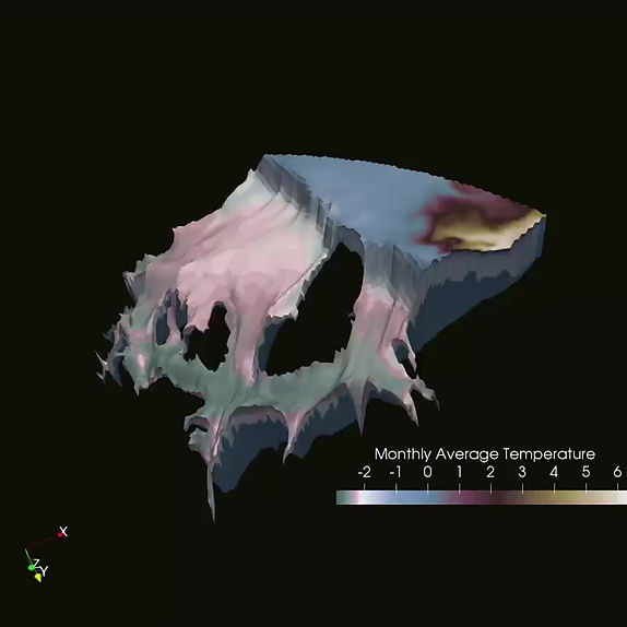
A personal project of mine, I created the Monet maps in order to explore new forms of palette-making that feel expressive and rooted in familiar, natural constructs. You can see an illustration of where I pulled colors from Monet's Wheatstacks painting, then view those colors below applied in a continuous wave gradient (moving from low to high luminosity and back again). The final video shows the map applied to ice temperature over the course of one year on the Ronnie Ice Shelf, part of the Arctic sheet. Its temperature is important to monitor as, according to recent research, if that shelf melts, much of the arctic will go with it. The Ronnie acts as a cork to the Arctic's champaign bottle.
Data courtesy of Los Alamos National Labs.
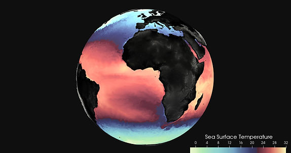
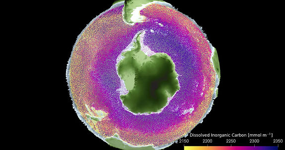
AGU BIOGEOCHEMISTRY AND OCEAN CURRENT TRACKING
For the American Geophysical Union's annual Digital Storytelling Contest, a team including Riley Brady, PhD candidate at CU Boulder, Annie Bares, Master's student at UT Austin, and myself collaborated on this visualization project. Riley supplied the data, Annie created the video script and I worked with Riley and his data to supply custom colormaps and advise on video perspectives. The result was these three clips: the first, global sea surface temperature, the second, global dissolved inorganic carbon, and the third, simulated garbage patch collection through global ocean currents using a new simulation technique.


INFO VIS/GRAPHICS
When not working on environmental visualization, I often make extra money on the side by creating infographics for various media groups. This gallery contains a few examples of such work.